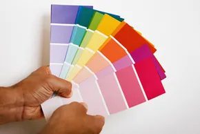
It’s easy to take the visual world for granted. We see the blue sky or the gray hospital wall and just accept them as facts. But those colors do more than fill space. They affect your head. They affect your body.
Most of us can’t imagine life without hue. But understanding why that matters is tricky. You might think there’s a rulebook. A way to predict exactly how someone will feel when they walk into a room painted a specific shade.
Researchers haven’t found one.
There is no universal classification system. Not yet. If there were, interior designers would have it figured out by now. The truth is messier. Your culture changes how you see red. Your age shifts your reaction to yellow. Your current mood? That matters too. Even the specific combination of colors in a room alters the effect.
This field is called color psychology. It’s closely tied to color preference. And it’s huge.
Why Marketers Care About Your Walls
This isn’t just academic theory. It’s money.
Marketing departments pour resources into this stuff. Logos. Lobbies. Uniforms. They want to know what makes a customer pause. What makes a patient feel calm. What makes a baby sleep.
Fashion designers use it. Hospital architects use it. Nursery planners use it.
If you’re trying to sell a house, you’re playing the same game. Buyers walk in. They scan. They feel. Before they even notice the square footage or the hardwood floors, they’re reacting to color.
The goal? To find the right splash of paint. The kind that makes a buyer stop scrolling and start touring.
Natural Reaction vs. Learned Symbolism
Here is where it gets confusing.
People have strong, almost physical reactions to color. These are natural. We don’t learn them. We just feel them.
Then there is symbolism. That’s learned. It’s cultural. It’s historical.
Take green.
Naturally, green feels refreshing. Peaceful. It’s in nature. We evolved to associate it with safety.
But symbolically? Green means luck. It means money. It means St. Patrick’s Day. It means the Green Bay Packers. These aren’t natural reactions. They’re associations we picked up along the way.
Don’t mix them up.
When you’re painting a room to sell your house, you’re not fighting symbolism. You’re tapping into something deeper. Something visceral.
The color wheel is the starting point. But the psychology behind it? That’s what moves people.
“Associating the color green with refreshing, peaceful feelings is natural, but associating it with luck and money is symbolic.”
Next, we break down specific colors. Which ones work. Which ones don’t. And which ones might just cost you thousands in potential offers.
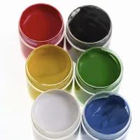

Most people think they just pick a color because it looks nice. They don’t. Their brains are reacting to deep-seated associations that can speed up a sale or kill it dead. It’s not a universal rule. If you had a traumatic experience with a specific hue, your reaction will be skewed. But for the average buyer, certain colors trigger predictable emotional responses.
The Emotional Weight of Basic Hues
Start with the basics. The classic eight-crayon box holds the keys to the psyche.
Red is the loudest. It demands attention. You see it on stop signs and warning labels for a reason. It raises the heart rate. It signals energy, aggression, and strength. In a home, a little red goes a long way. It draws the eye immediately.
Orange is polarizing. You either love it or hate it. It screams flamboyance. It feels warm and comfortable, but it can also feel chaotic if used too heavily.
Yellow is tricky. It promises happiness and optimism. It stimulates the mind. But get the shade wrong, and it induces anxiety. It can feel cowardly or overly bright. It’s a high-risk, high-reward color.
Green is the safe bet. It’s the second most popular color for a reason. Natural greens feel balanced. They soothe. They evoke peace and fertility. But too much of a sickly shade can make a room feel bland or even nauseating.
Blue is the winner. Most people prefer it. It triggers calming chemicals in the brain. It feels logical and dependable. It’s focused. In a workplace, blue boosts productivity. In a home, it creates a sense of calm order.
Purple sits between red’s energy and blue’s calm. It can feel luxurious and wise. But in uncertain shades, it can make people feel introspective or uneasy.
Black carries weight. It’s authoritative. It’s powerful. In the West, it’s tied to mourning. (In the East, white takes that role.) It can overwhelm a small space.
Brown is the anchor. It feels stable. It’s natural. It suggests reliability and wholesomeness. It grounds a room.
Beyond the Hue: Saturation and Brightness
These are just the base hues. But color isn’t just about what the name is. It’s about how it’s applied.
You have to look at saturation. This is how vivid or pale a color is. A neon pink is saturated. A pastel pink is unsaturated. They feel completely different.
Then there’s brightness. Also called intensity or value. This is the amount of light energy in the color. A dark navy feels heavy. A light sky blue feels airy. The same hue can change the entire mood of a room based on these two factors.
Color psychology isn’t just theory. It’s a tool. It’s used in marketing. It’s used in web design. It’s even used in medication packaging. But there’s one application that’s currently dominating the real estate market.
Applying Color Psychology to Sell a Home
Selling a house is about more than square footage. It’s about feeling. Buyers make quick judgments. Often, they make them subconsciously.
If you’re preparing a home for sale, you can’t just paint every wall white. That’s a cliché for a reason—it’s safe—but it’s also boring. You need to understand what specific colors do to a buyer’s mood.
The next section dives into how to actually use this knowledge on the market.


Color psychology isn’t just a marketing buzzword. It’s a tangible factor in home sales. Both inside and out, the right hues can stack the deck in your favor. If you have a house to sell, one of the best moves you can make is to apply a fresh coat of paint before listing it. This step is highly recommended. But it comes with caveats. Ignore them, and you might hurt your sale price.
Let’s look at the exterior first. You might love orange. You might love purple. Don’t paint your house those colors. When selling, your goal is to appeal to the widest pool of potential buyers. You need to think like a buyer, not an artist.
White is the safest bet. It’s clean. It’s bright. But you have to consider the neighborhood. Pick colors that blend with the general scheme of your neighbors’ homes. A poorly painted house can drag down the value of homes up and down the street. It’s not just about your curb appeal. It’s about street value.
Best Exterior Colors for Selling
Here’s a rundown of popular potential colors for your house’s new look:
- White
- Gray
- Blue
- Tan/Brown
- Cream
- Beige
- Green
- Yellow
- Red
Muted neutral hues at the top of that list are the most strongly recommended. Why? They convey that the house is bright, clean, and spacious. Light shades make the home appear new and fresh. They’re also less likely to fade over time. Darker colors absorb heat and show wear faster.
Trim, shutters, and doors are a different story. You have more freedom here. If you can’t paint the entire exterior, concentrate your efforts here. The front door is key. A warm, welcoming color makes a favorable impression. Bright blues and reds work well. They pop.
When choosing secondary colors, watch how they interact. It can make or break the scheme. If you don’t have an eye for this, hire a color consultant. It’s worth the money to avoid clashing tones.
Interior Color Strategy for Buyers
Now step inside. Color psychology applies here too. Light, neutral colors make rooms look bigger. Off-white is the top choice. Use a primer to cover dirt, stains, and outdated schemes. It creates a blank slate.
If you can’t paint every interior area, prioritize the entry room. Hit any problem areas. Focus on smaller rooms that benefit from a size-enhancing coat of paint. A cramped bathroom feels larger with light walls.
Let people know about the new paint job. Mention it in ads. Flyers. Listings. Note when the job was done and the quality of paint used. It signals care. It signals maintenance.
Check HOA Rules First
Picky about paint? Check with your homeowners’ association if there’s one. They might have restrictions on colors. Violate them, and you’ll face fines or forced repainting. Do your homework before buying a single gallon.
Common Questions on Color and Mood
Does color affect mood? Yes. Emotions and color are linked. There’s no universal system, though. Reaction depends on culture, gender, age, and personal experience.
How is color psychology used in marketing? Logos to lobbies. Red increases appetite (fast food). Blue builds trust (banks). Purple suggests luxury (chocolate).
What is the most popular color? Most agree on blue. It triggers calming chemicals in the body. You don’t need to paint the whole house blue. Accents work.
What emotions do colors cause?
- Red: Strength, courage, aggression, excitement.
- Orange: Energy, warmth.
- Yellow: Enthusiasm, optimism.
- Green: Peace, refreshment, luck.
- Blue: Dependable, loyal, calm.
- Purple: Loyalty, quality, wisdom.
What color is associated with joy? Yellow. It evokes happiness. But it’s rarely a good choice for painting your home. It can be overwhelming. Use it sparingly.
How Color Affects Home Resale and Buyer Perception
You might think paint is just a finish. It isn’t. It is a lever. Pull it right and your house sells faster. Pull it wrong and buyers walk out. The data is clear. Repainting is the single most cost-effective way to boost resale value.
Real estate experts agree. New paint covers scars. It hides the previous owner’s personality. It makes spaces feel larger. Neutral tones are the safe bet. Whites. Beiges. Greys. They don’t distract.
But why does this happen? It’s biology. And psychology.
The Science of Seeing Color
How do we see color? It starts with light. Light hits an object. The object absorbs some wavelengths. It reflects others. Those reflected waves hit your retina. Your brain interprets them.
This process explains why some rooms feel heavy. Dark colors absorb light. They shrink a space. Light colors reflect it. They open it up.
Colorblindness affects about 8% of men. They see the world differently. For them, red and green are hard to distinguish. If you’re painting a home for sale, avoid high-contrast red/green combos. They can look muddy or aggressive to some viewers. Stick to low-saturation neutrals.
The Psychology of Choice
Why do girls wear pink and boys wear blue? It’s not biology. It’s marketing. The swap happened in the mid-20th century. Before that, pink was for boys (a stronger color). Blue was for girls (delicate).
This history matters for home decor. Buyers bring their subconscious biases. Red triggers urgency. It raises blood pressure. Use it in moderation. Maybe a kitchen accent. Not a bedroom wall.
Blue calms. It lowers heart rate. Bedrooms are the best place for blue. Bathrooms too.
Yellow boosts energy. It’s cheerful. But too much yellow causes agitation. Use it in kitchens or dining areas. Where you want appetite and movement.
Exterior Paint That Lasts
Where do you start? Outside first. Exterior paint faces sun and rain. UV rays break down pigments. Moisture causes peeling.
Choose high-quality acrylic latex. It breathes. It expands and contracts with the wood. Oil-based paints crack. They become brittle.
Check the weather. Humidity ruins paint jobs. Don’t paint in direct midday sun. The paint dries too fast. It leaves brush marks. It doesn’t level out.
Clean the surface. Power wash. Scrape loose paint. Prime bare wood. Skip these steps and you waste money. The paint will fail in two years.
Interior Application Tips
Which tools do you need? A good roller. Not the cheap ones from the hardware store base. Get a high-density foam roller. It leaves a smoother finish.
Use painter’s tape. Blue tape is standard. Masking tape is too sticky. It rips the drywall.
Cut in first. Use a 2-inch angled brush. Go along the edges. Corners. Ceilings. Let it dry. Then roll the main area.
Two coats are standard. One coat looks thin. It shows patches. It feels cheap.
The Market Reality
Why do realtors insist on painting? It’s about speed. A freshly painted house feels new. It feels move-in ready. Buyers don’t want to see your wallpaper. They want to imagine their own life there.
Studies show homes with neutral paint sell faster. They sell for higher prices. The ROI is huge. A $300 can of paint can add thousands to the offer.
Don’t overthink it. Neutral doesn’t mean boring. It means versatile. It lets the architecture shine. Let the light do the work.
Sources like Color Matters and various real estate journals confirm this. The consensus is consistent. Paint sells houses.
Is there a color that fails every time? Yes. Black. It’s too dark. It makes rooms cave in. Unless you’re going for a specific modern aesthetic. Avoid it in standard suburban homes.
What about green? It’s nature. It’s growing. It’s calming. Sage green is a strong contender. It bridges the gap between neutral and character. Use it in dining rooms. Or on a front door.
The key is consistency. Match your interior to your exterior. Don’t paint the front door purple if the walls are beige. It sends mixed signals.
Buyers notice details. They notice the trim. The baseboards. The window sashes. Paint them too. White trim on a white house. Or white trim on a dark house. It frames the view.
Don’t forget


