Start with what you already love. Look at your grandmother’s kitchen or a friend’s library. Maybe it’s the way the light hits the table. Or the smell of old books in a study. You don’t need to start from scratch. You just need to borrow.
Finding a style that fits your life doesn’t mean tearing out floors. It means mixing. Heirlooms blend. Furniture is recyclable. The rigid rules of the past are gone. You can have the look you want your way.
Зміст
Why Style Matters in Home Decor
Every decorating style has a fingerprint. Brass candlesticks and highboys signal Colonial. Curvaceous side chairs and wall-hung porcelain dishes whisper French provincial. These aren’t just trends. They are clues to your taste.
Compile a list of favorite rooms. What draws you in? Is it the warmth of wood? The cool clean lines of modern design? Or the chaotic charm of flea market finds?
“Familiarizing yourself with popular modes of decoration will jump-start those creative juices.”
This isn’t about copying a magazine cover. It’s about creating a space that reflects you.
Traditional Home Decorating
Traditional home decorating has been around for a long time. It’s often associated with older generations. But it’s been updated. Young families can embrace this look now.
Think cozy. Think rich textures. Think fabrics that feel good against your skin. You don’t need a formal dining room to make this work. A simple update to your living room can bring in the traditional vibe.
Start with a color palette. Earth tones work well. Deep reds, greens, and browns. Add in some antique-style furniture. It doesn’t have to be old. It just has to look like it has history.
Country Decorating Style
Country styles vary. Simple American country is clean and uncluttered. French provincial is more elaborate. Both have their place.
If you like simple, stick to light woods. White painted furniture. Natural fabrics like cotton and linen. Keep it airy.
If you like elaborate, look at curvy lines. Floral patterns. Porcelain accents. Don’t be afraid of detail.
Cool Contemporary Decorating
Contemporary design used to be cold. Austere. Now it’s warm. Welcoming. It still keeps clean lines. But it adds texture.
Think about the environment. Contemporary design often pushes into the eco-friendly arena. Sustainable materials. Energy-efficient lighting. It’s not just about looks. It’s about how the space works.
Use neutral colors. Add pops of black or white. Keep clutter to a minimum. But make sure the room doesn’t feel empty. A large sofa. A statement lamp. Something to anchor the space.
Eclectic Decorating
Do you have a bunch of stuff you love? But it doesn’t fit one style? That’s eclectic.
Combine your favorites. Don’t worry about matching. Mix patterns. Mix eras. Mix cultures. The key is balance.
Start with a dominant color. Then add in different textures. A rustic table. A modern chair. A vintage rug. It should look intentional. Not random.
Decorating Retro-Style
Retro decorating is for vintage collectors. Flea market shoppers. People who love history.
Display your treasures. Let them be the focus. A mid-century modern chair. A retro kitchen appliance. A vintage poster.
Don’t try to make everything look new. Embrace the wear. The patina. The story.
Decorating with a World Flair
African. Indian. Asian. Scandinavian. The world is full of unique cultures.
Bring these elements into your home. Use textiles from different regions. Add artifacts from your travels. Or just appreciate the aesthetics.
A Scandinavian rug. An African mask. An Indian textile. Each adds a layer of depth. It makes the space interesting.
Arts and Crafts Decorating
Arts and Crafts design draws from nature. Wood and stone. Natural colors. Simple lines.
The look is sleek but warm. It feels honest. No fussy details. Just clean craftsmanship.
Use raw materials. Exposed beams. Stone fireplaces. Wooden floors. It’s a grounded style.
Casual Chic Decorating
Casual chic is country with a twist. It’s a blend of patterns and colors.
Inviting. Homey. Rich. Use a mix of patterns. Stripes. Florals. Checks. But keep the color palette cohesive.
Textures are key. Velvet cushions. Wool throws. Rough wood tables. It should feel comfortable.
Southwestern Decorating
Inspired by wide-open spaces. Spare looks. Minimal furnishings. But full of character.
Think desert colors. Terracotta. Sage. Sand. Add in some leather. Metal accents.
It’s not cluttered. It’s curated. Every piece has a purpose.
Spacious Decorating
Spacious design unifies areas. Open floor plans. Flowing spaces.
It connects seating areas to dining. To kitchen. To bedrooms. The design flows easily.
Use large rugs to define spaces without walls. Keep sightlines clear. Let the light in. It creates a feeling of unity.
Next Steps for Your Decor Project
You’ve picked a style. Or maybe a mix. Now what?
- Interior Decorating: Get tips on how to decorate your home. Organize your project. Select a design that fits your lifestyle.
- Home Decorating Tips: Learn about styles. Plan your projects. Complete them without stress.
- Decorating a Room: Go floor-to-ceiling. Don’t forget the ceiling. Or the floor.
- How to Design a Kitchen: Create a kitchen that works. Choose appliances. Place them right. Create a scheme.
- Kids Rooms: Decorate for your child. Use smart strategies. Save money.
Start small. Pick a room. Try one style. See how it feels. Adjust. Add. Subtract.
Your home is yours. Make it work for you.
The Modern Twist on Traditional Home Decor
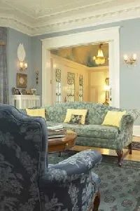
Traditional home decorating used to mean sticking to strict historical periods. You had your Georgian spaces or neoclassical parlors. They were rigid. Today, the definition has loosened. Now, it’s about mixing polished pieces from various eras and countries. Or just buying high-quality reproductions. The goal is luxury and accouterment.
Cary Grant and Grace Kelly fit right into this aesthetic. They look at home here. But the style has evolved. Young families can inhabit these spaces now, too. The vibe is fresher. Lighter.
If you own an older home, you are ahead of the game. The existing decorative trim and detailing pair perfectly with refined decor. Newer houses? They need a little help. You have to add architectural embellishments yourself. Apply decorative paint techniques like stippling and combing. It fosters background elegance. It creates the necessary context for the style to work.
Materials and Textiles
Walk into a classic traditional room and you’ll see the basics. Thick Oriental rugs on gleaming hardwood floors. Skirted tables. Gilt-framed mirrors. The window treatments are elaborate. Think tassel-trimmed swags and jabots.
There is a fresher approach, though. It shifts the palette. Instead of rich warm tones like red or yellow, walls are washed in taupe, cream, or pale lavender. The window dressings change too. They become tailored drapes, sheers, or shades. Simpler.
No matter the tone, comfort is king. It doesn’t matter if the room looks sophisticated or relaxed. A living room with classic shapes and styles is an invitation to sit down. Even if it looks formal, it invites you to make yourself at home.
Take an inherited Empire sofa. In a true traditional setup, the seat cushions are revamped. They are comfortable to sit in. Think of curl-up-and-finish-that-novel wing chairs. Camel-back sofas.
Arrangement and Lighting
Furniture is arranged with symmetry. It creates companionable groupings. This fosters conversation. Guests never hunt for a place to set down a drink. Every sofa and chair has a table at its disposal. It is intentional.
Upholstery varies. It can be simply handled or lavish with decorative trimming. Fabrics differ based on the approach. Brocade and cut velvet suit a stately 19th-century home vibe. Linen or wool works when the approach is pared-down.
Lighting is critical. It is carefully manipulated. You need a combination of table and standing lamps. This provides adequate illumination. Whether you have a large gathering or are just one person reading by the fire.
Finishing Touches
Oil paintings, sporting prints, and assorted objects d’art are standard. They are de rigueur in timeless traditional rooms. Actually, carefully controlled clutter is important. Piles of art books. Plaster busts. An old globe. These elements create a welcoming ambience.
Contemporary accent pieces can figure in. Fabrics and art from the current era are okay. But nothing too glaringly new. If you want a lean-cuisine traditional room, edit out the extras. Keep furnishings minimal. Let the architecture shine through.
You can spot a traditional bedroom from the doorway. It’s not just about the furniture. It’s about the vibe. Family photographs line the walls. Ultra-feminine dressing tables sit near the window. The room is built for living, not just sleeping. A bench rests at the foot of a four-poster bed. Armchairs invite conversation. A writing desk offers a quiet corner for paperwork or letters.
Think about the bathroom next. Traditional design here is all about history. It draws from a specific era. White marble covers the floors and walls. It feels cool to the touch. Or you might go with black-and-white tiles. Painted walls add character. The tub itself should look like a period piece. Classical moldings frame the basin.
Materials matter more than brands here. Use mahogany or lustrous cherry wood. The cabinetry should look like furniture, not just kitchen storage. An antique buffet? Perfect. Convert it into a vanity. It adds soul to the space.
This style doesn’t stop at the bedroom door. Let it bleed into the kitchen. You’ll need highly polished granite countertops. They tie the room together. Glass-front cabinets are a must. Display your pretty china. Show off the silver. Pick appliances that blend in, not pop out. Polished brass hardware is the winner here. It warms up the metallics. For the floor, choose warm-colored wood or brick. It unifies the home.
The final touch is the window treatment. A lavish balloon shade adds drama. It balances a magnificent range hood. If you want something more relaxed, try unpainted wood shutters. Match them to the color of a handsome leather-bound book.
How to Execute Traditional Decor Yourself
Getting this look doesn’t require a designer’s eye. It requires specific choices. Here is how to start.
Add bookshelves. Fill them. The more books, the better. It creates instant authority.
Look at your upholstery. Add decorative welting to chairs and sofas. The piping adds structure. It makes the fabric look tailored.
Create vertical drama. Install oversized mirrors. They bounce light around the room. Mount curtains high. Run them from ceiling to floor. It makes ceilings feel higher.
Mix textures. Combine silk with sisal. It adds depth. Pair porcelain with pottery. Wood with silver creates contrast. Don’t be afraid of the clash.
Strip the rugs. Let polished floors shine. Traditional design loves to show off the foundation.
Country vs. Traditional Styles
Traditional decorating is tied to a period. It mimics history. Country decorating is different. It esteems the handmade. Craftsmanship rules. It looks lived-in. It looks well-used.
The next page explores country styles. American country. English country. French provincial. Each has its own flavor. Traditional design is the anchor. Country design is the escape.
For more on how to plan your projects, look into interior decorating guides. They cover everything from organizing a renovation to picking a scheme. Home decorating tips help you navigate styles. Decorating a room from floor-to-ceiling requires planning. Designing a kitchen involves appliance placement. Even kids’ rooms need smart strategies.
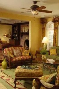
The hunt for country antiques didn’t start with a roar. It began quietly in the 1920s and 1930s. A handful of savvy collectors spotted the merit in unpainted furniture, folk art, baskets, and quilts. They saw value where others saw clutter. By the late 1970s, that quiet interest exploded.
A full-blown craze erupted for ladder-back chairs and other items associated with the country look. America got its first real look at the enduring beauty of handmade rag rugs and quilts. It wasn’t just about aesthetics. It was the start of a livable approach to decorating. This shift fanned a new enthusiasm for antique hunting, flea markets, and tag sales that persists today.
Well-known decorators like Sister Parrish had been using country pieces for years. Now, everyone was on the bandwagon. Versatile treasures like tilt-top tables and Windsor chairs suddenly appeared in upscale Manhattan apartments. The trend wasn’t a flash in the pan. Country elements have grown no less popular in the decades since.
The Umbrella of “Country”
The style has evolved. It absorbed design contributions from around the world. What we call “country” is now an umbrella term. It encompasses American, English, and French styles. It also includes the specific looks detailed below.
Even rustic Adirondack chairs, colorful Native American blankets from the Southwest, garden furniture from across the Atlantic, and early 19th-century porcelain china have found a place in this broad category. The components differ based on personal taste and region. Yet every country room, whether trimmed down in a contemporary mode or rich with layers collected over time, exudes a comfortable, relaxed spirit.
Apple-Pie American
The simple, unpretentious look of American country is easily adaptable. You can create warm, cozy rooms like the early settlers did. Or, you can aim for open, more modern country spaces. What’s the starting point for your own renovation or refresh?
Colors are a major factor. Think of the palette our Founders knew. Cheery barn-red, yellow, dark green, gray, buttermilk, rust, and straw. Or try marriages of neutral walls with trim done up in heady colors such as blue and wine-red.
For a contemporary country look, especially in a small space, the strategy changes. Paint your room’s walls, trim, and ceiling cream or soft white. This brightens the space while keeping the rustic roots intact.
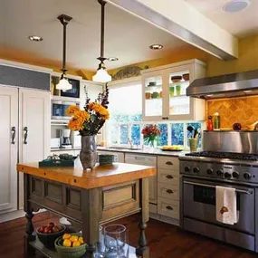
Hardwood and Textiles
Refinishing existing wood floors is often the most rewarding first step. It lets you show off the natural grain and reflects light better than any synthetic surface. If the original wood is gone, paint a classic diamond pattern. It creates a stunning backdrop for 18th- and 19th-century American antiques. For high-traffic areas like kitchens, consider pre-finished look-alike wood floors. They come in various wood types and handle abuse better than raw timber.
Don’t ignore the gaps. Floor-cloths, flat-weave rugs, and thick rag rugs add texture. They pump up the interest level without costing a fortune.
Window treatments should be simple enough to let breezes tug at the hems. Roman shades or half curtains in natural fabrics work best. Cotton, linen, and wool are alluring choices. When it comes to upholstery, stick to simple, off-the-loom patterns. Plaids, checks, and stripes in spongeware-blue, lime-green, or butter-yellow fit the aesthetic.
Furniture Selection
Furnishings need to be restrained but welcoming. You want pieces built for years of sitting. Sofas and chairs should be sturdy. Dining tables need to be generous enough for a crowd. Beds should feel indulgent. Pile on blankets and pillows in winter. Strip them down to fresh cotton sheets in summer.
Accessories should foster an American country attitude. Hang patchwork quilts as art. Use baskets, hand-carved toys, tinware, and chunky creamware pitchers. In the kitchen, clean-lined Shaker or raised panel cabinets keep the momentum going. Mix glass and solid doors. Combine wood-tone and painted cupboards for depth.
Display your collection of black iron pans or copper pots. Don’t let them jumble. A few favorites are better than a cluttered mess. If you are renovating a bathroom, claw-foot tubs and old-style sinks are readily available today. A standard white tub encased in tongue-and-groove paneling or slate is another option. Our ancestors would applaud that durability.
Flooring and Lighting
Lay durable ceramic tiles in country-like checkerboard designs. Use them on walls and floors. Include Shaker-style peg rails to hold towels and robes. Designate wooden cabinet hideaways for everyday toiletries.
As night falls, light the candles in a wrought-iron chandelier. It sets the mood for the entire room. American country style is a celebration of simplicity.
Get the Look
- Recruit reproduction Windsor chairs to paint in new country colors.
- Hunt for old burnished wood pieces to lend authenticity.
- Anchor small items on trays or in baskets.
French Provincial Textiles and Walls
How could French country style be anything less than charming? France is renowned for its food, wine, and appreciation of the good life. The aesthetic includes well-loved 18th-century toile de Jouy patterns. These common “toile” designs are peppered with endearing images of pastoral life.
Today, toile is available in a rainbow of colors, as well as hip black and white. You can find it as wallpaper or accessories. Build a living room around a striking black-and-white combination. Or feature a bedroom with soft blue toile the color of a wildflower. Because toile generally has only one color on a neutral background, it mixes pleasingly with other patterns.
Layer in striped, checked, or solid accent pillows. Use the dominant color from your print. Typical French-country window treatments include lace, cotton, or simple panels of unbleached linen. Hang them from iron rods. In a more formal country room, try striped taffeta in a sunbaked shade like tangerine.
White or color-washed walls in soft tones like peach, honey, and dusty rose evoke a French mystique. Pair them with a terra-cotta-tiled floor.
Furniture and Cabinetry
For furnishings, look to gently curved armchairs. A decoratively carved or painted armoire is the most important furniture piece in provincial homes. Armoires trace back to the 14th century. Today, they can house your TV to serve modern needs.
Include a farmhouse dining table. Add simple ladder-back chairs with rush seats. If you have trouble finding antiques, furniture manufacturers offer a wealth of fitting reproductions. Look for beguiling sofas and love seats to combine with tag-sale finds.
To imbue a kitchen or bath with the flavor of Provence, choose cabinetry with an antique white or mellow wood finish. Suspend a chandelier with dainty fabric shades from the ceiling. Consider adding French elements like paintings or prints echoing the impressionist’s palette. Use hand-painted tiles, murals, glazed or unglazed pottery, and delicate bed linens. Complement a carved pine or fruitwood bed with these details.
Get the Look
- Include one or two more formal pieces along with casual furnishings.
- Re-cover the seats of curvy armchairs with cheerful checks or stripes.
- Hang a collection of pretty porcelain plates on the wall instead of a painting.
- Incorporate more curves, such as a wire lamp or plant stand.
- Add a still-life of finials along the mantel or a half-round table with cabriole legs.
English Eclectic Layers
English country style is confident. Patterns, colors, furniture styles, and periods are mixed freely. Nix anything that appears too new. Time’s patina is perfect here.
Sun-bleached chintzes in all the colors of a summer garden mimic a Cotswold farmhouse. Layer in slightly worn rugs. Pile them atop a sea of sisal or a bare wood floor. The goal is comfort, not perfection.
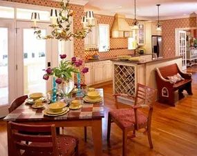
British Cream and Contrast
Paint the walls a thick, creamy white. This choice reflects light, making the space feel airier. To keep it from feeling sterile, add jolts of ocher or cantaloupe. These deep, warm tones ground the room.
Go for wood paneling up to the dado rail. That’s the lower section of the wall. Paint it or cover it with wallpaper. For the upper portion, try thin stripes. A small geometric pattern works too. Trellises or simple flowers add that specific charm.
A British mood isn’t about being perfect. It looks like it evolved slowly. Link your wallpaper to slipcovers via color or pattern. But keep it subtle. Tartans, tweeds, paisley, chenille, cashmere, or basic gingham give you options for every taste.
Window treatments range from straight unlined curtains to formal valances with drapery panels. Choose based on the vibe you want. Casual or stiff? Both fit the English country aesthetic.
Furnishings should feel timeless. Think comfy sofas and armchairs for the living room. Place a chaise by the bedroom window. A scrubbed pine dining table anchors the eat-in space. Mix heirlooms with flea-market finds. Arrange collectibles informally.
In the kitchen, fine-grained hardwood cabinets pair well with freestanding cupboards and hutches.
Get the Look
- Pull your color palette from English chintzware porcelains on a shelf.
- Use a tray-style table as a coffee table.
- Order roomy slipcovers for down-filled seating.
- Replace cabinet door insets with shirred gingham.
Tuscan Texture and Earth
Tuscan country is a mosaic of texture. It’s more tactile than other styles. Rough-plastered walls in sun-washed hues are standard. Floors are hard terra-cotta tiles, stone, cement, or unpolished marble.
This style favors warm climates. But modern technology makes it possible in colder regions. Radiant heating keeps floors toast-warm even in the north. You can replicate sun-bleached effects with available paints.
Furnishings are minimal. A dining room might hold only an antique table and mismatched chairs. Edit carefully.
Offset the sparse arrangement with heavy textiles. Velvet drapes over sheers work. A tapestry wall hanging adds depth. Think ancient mural. Pictorial wallcoverings depicting rural scenes also fit.
Unpainted furniture adds character. Pottery, baskets, and candle-holding sconces complete the flavor.
Get the Look
- Create a utilitarian centerpiece. Fill an iron basket with fresh fruit on a tile counter.
- Order a deep soapstone sink.
- Lay a tapestry runner down a rustic table.
Rustic Cabin Energy
Rustic country is eclectic. It shares DNA with American style but feels wilder. Exposed rough-hewn beams and open rafters define the ceiling. Wide-plank floors add to the pioneer cabin vibe.
You need a fire on the hearth. Cozy textiles are non-negotiable. Stick to a warm palette of earth tones. Accent with autumnal reds and golds.
Think lakeside camp or mountain hideaway. A mounted pike over the fireplace sets the tone. Snowshoes in the corner. A fishing rod by the door.
Vintage signs and old photos adorn unpainted wood-paneled walls. Twig rockers and settees provide seating. Comfy sofas slipcovered in plaids or large cotton checks round out the room.
Windows are either bare or covered with simple burlap panels or wood shutters. Accessories lean natural. Hand-blown bottles. Pressed ferns under glass. Birdhouses. And the ultimate touch? A real canoe hoisted to the ceiling.
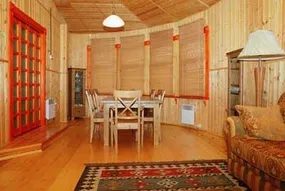
Upgrading the Southwestern Vibe
Skip the wood paneling. It feels dated and heavy. Instead, lean into stucco or plaster walls. They catch the light differently, giving the room a softer, earthier texture that fits the Southwestern theme without trying too hard.
Then, pile on the textiles. Native American blankets and rugs are non-negotiable here. Look for bright, bold patterns. Stack them. Throw them over chairs. Drape them across sofas. The goal is visual weight and color.
For the floor, terra-cotta tiles are the standard. They wear well. They look good with dust. If you can’t do full tile, a rug in similar tones works. Add wrought iron furniture. Ebony-finished pieces nod to the colonial Spanish influence of the region. It’s a subtle historical reference that grounds the space.
A bleached cow skull on a wall? It’s a direct nod to Georgia O’Keeffe. It’s iconic. It’s recognizable. Just make sure the skull is clean and positioned intentionally.
Scaling Up for the Ski Lodge
Take that same aesthetic and cranked up the volume. A ski lodge version demands texture and scale.
Swap the hooked rugs for faux-fur throws. Toss them on beds. Drape them over seating. It adds immediate warmth. Leather upholstery replaces fabric where possible. Think heavy, durable leather chairs that can handle snow boots and muddy boots.
If the structural integrity allows, go big. Oversized everything. A massive four-poster bed. A dining room cactus in a pot that looks like it was dug up from the yard. Scale creates that “home-on-the-range” feeling. Big sky magic requires big furniture.
The key is layering textures—stucco, leather, fur, and stone—to create a space that feels lived-in and ruggedly comfortable.
How to Get the Look on a Budget
You don’t need to buy new. Vintage is better for this style anyway. It has character.
- Blankets: Hunt for vintage Pendleton or Beacon blankets. They’re durable and authentically patterned. Use them as wall hangings too. They make great art when you don’t want to drill into plaster.
- Rugs: Look for folksy, patterned rugs. Place them beside beds. Put one in front of the sink. It catches moisture and adds warmth underfoot.
- Storage for Tech: Hide your electronics. Don’t let the cords ruin the aesthetic. Use a distressed cabinet. An antique pie safe with tin-paneled doors is perfect. It keeps the gear out of sight but accessible.
Moving Toward Contemporary
This Southwestern approach shares DNA with contemporary design. Both can be warm. Both can be inviting. Neither has to be cold or sterile.
The next step in the design journey is contemporary decorating. It’s sophisticated. It’s clean. And these days, it often embraces environmentally sound design principles. Sustainable materials. Energy efficiency. Less waste.
Contemporary doesn’t mean minimalism. It means intentional design that respects the environment while looking sharp.
Next Steps for Your Home
If you want to dig deeper into these styles, here are the areas to focus on:
- Interior Decorating: Focus on organizing your project. Select a style that fits your actual lifestyle, not just what you saw on Pinterest.
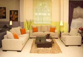
Contemporary design isn’t just about white walls and empty rooms anymore. It’s a style that balances two distinct moods: the subtle drama of minimalism and the bold impact of vibrant color. You have to decide which vibe fits your space better. The old days of stark, laundry-white interiors are over. Today’s monochromatic rooms rely on soothing, earthy tones. Think sand, gray, or cream. These shades create a calm backdrop that feels grounded rather than cold.
There is also a growing push to bring the outdoors in. Designers are pulling pale green and soft blue tones from nature to offset light wood and metal fixtures. It’s a natural evolution. The goal is a space that feels connected to the environment without sacrificing modern sleekness.
Materials Over Chrome
Gone are the days when “modern” meant a marriage of black and chrome. That ’80s aesthetic feels dated now. Current contemporary decorating style prefers a mix of materials. Metal, glass, and stone are combined in innovative ways. You’ll see polished surfaces meeting textured stone. It adds depth without clutter.
Furnishings reflect this shift. Clean lines dominate. Chairs and tables feature intriguing shapes that defy traditional forms. Antiques have little place here unless they are starkly modernized. Upholstery is impeccable. It’s tailored like high-end fashion. Slipcovers often include dressmaker details. Look for rows of dainty buttons or demure bows. These small touches elevate the look from basic to bespoke.
Window Treatments and Textiles
Patterns are rare in this style. If you use them, they are subtle. There’s no jarring visual noise. The ubiquitous accent of red? Almost never seen. Instead, focus on texture and drape.
Window treatments are slimmed down to blend with the wall color. They don’t contrast. They disappear into the background. Choices include fabrics that drape well. Silk, rayon blends, and wool are top picks. For blinds, aluminum, vinyl, or split bamboo work best. No flounces. No frills. In these sophisticated, bare-bone settings, artisanship is what counts. The quality of the weave matters more than the print.
Curating Accessories
Accessories should enhance the look, not clutter it. Avoid bric-a-brac. Clean surfaces are essential. They enhance the contemporary feel by keeping the eye moving across the space without getting stuck on visual debris. But that doesn’t mean the room is empty. It means every item has a purpose.
What works? A collection of silver desk objects from the 1930s and 1940s displayed on a glass-topped table. It adds history without heaviness. Salvaged finials on a mantel provide vertical interest. They catch the light differently than standard decor. Pottery from the same era is also effective. Dusty, pretty ceramics lined up smartly in a built-in bookcase create a rhythm. They look like soldiers standing at attention.
Pairs are your friend. Lamps, urns, and vases in matching sets provide harmony. They anchor the room. The balance is intentional. It’s not about having less; it’s about having only what matters. The result is a space that feels curated, not just decorated. It leaves room for life to happen.
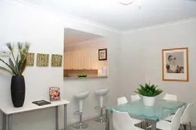
Color isn’t just decoration. It’s structural. In a contemporary home, bold hues define living areas and create detailing that new designs often lack. Ranch houses handle this treatment best. Older homes can work too. The goal is to turn spaces into gallery-like scenes. This framing helps vivid paintings, prints, and posters pop.
Don’t let the energy get chaotic. Combine mid-century modern pieces with new designs. Think skinny upholstered chairs. Look for leather seats with built-in shelving. Keep large upholstered items like sofas in neutral fabrics. This prevents a buildup of kinetic energy. It grounds the room.
Geometry Over Randomness
A hodgepodge of patterns is a trap. Careful arrangement of shapes beats random chaos every time. Mix round, square, and rectangular forms. This interjects real interest. If you want to make a statement, go custom. A rug that echoes the room’s colors is the icing on the cake.
Surface Materials Define the Era
You don’t need a full gut renovation to update a space. Changing surface materials can catapult a room into the present. Stainless steel. Tile. Laminates. Research these options thoroughly.
For the kitchen, consider an island in a sleek, modern shape. It needs to be functional. Choose industrial-style appliances. They are no-nonsense. They fit the aesthetic. Consider cement for counters and floors. It is vogue but also long-lasting. You can tint it in appealing earth tones.
Less Clutter, Less Cleaning
Lighting fixtures and hardware play a prominent role in these spaces. There is no clutter to hide behind. Everything from audio gear to grooming supplies needs a place. This means less daily tidying for you.
A contemporary setting demands every object has its place, which significantly reduces daily cleaning time.
Get the Look on a Budget
You can achieve this vibe without breaking the bank. Focus on these key elements:
- Natural Materials: Create an aura of calm with leather, suede, and cement.
- Affordable Reproductions: Hunt for classic furniture with geometric forms.
- Minimal Accessories: Less is more. Minimize the clutter.
If this strict minimalism feels too cold, eclectic decorating might be your style. It allows for a diverse scheme. You maintain balance between furniture and objects that appear unrelated. The next step is learning how to curate that chaos without losing coherence.
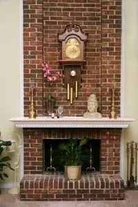
An eclectic room tells a story about its creator that no other decor style can. It is not just a collection of objects. It is a narrative woven from diverse furnishings, fabrics, and finishes pulled from many periods and countries. You are not bound by rigid rules. This freedom allows for a totally unique scene that feels personal rather than curated by a committee.
But freedom does not mean chaos.
To make an eclectic space work, you still need to respect the basics. Form. Scale. Composition. Proportion. These principles keep the eye from getting tired. But within that framework, you can be as original as you like. There is really only one hard rule.
Comfort.
“The only requisite is comfort.”
If your family and friends cannot sit down and stay for a while, the design has failed. Agreeable seating and good lighting are non-negotiable.
Why Bedrooms Are Naturally Eclectic
Bedrooms tend to fall into this eclectic style by accident. Or design. It depends on how you look at it. You likely have a bed you love. Maybe a chest you’ve had since childhood. Then, odds and ends accumulate. That rocker from your grandmother that won’t work in the living room. An old portrait found at a flea market. These items have history. They have weight.
The result can be incredibly charming. But it is not guaranteed.
Decorators warn of a messy overload. This is the trap. When you have too many contrasting styles fighting for attention, the room feels frantic. In a living room or a great room, eliminating wallpaper and heavy decorative finishes is the safest route. A neutral palette allows various styles to mix congenially. If the background and furniture forms are simple, the eclectic elements can shine without shouting.
Choosing a Palette for Mixed Styles
If whites and creams leave you feeling cold, do not force them. Choose a more contemporary color. Think pale rust. Straw. Smoke. These tones are sophisticated but not sterile.
Import accent colors that complement other elements in the room. Look at your rug. The dishes you are hanging on the wall. A favorite fabric on the sofa. Judicious amounts of color or pattern will help unite all the disparate elements. Place a pattern at the window. On a single chair. As a mat surrounding a print. Do not spread it everywhere. Concentrate it.
Flooring matters too. Carpeting can pull things together when used correctly. Sisal is often the most pleasing and inexpensive option. It adds texture without adding visual noise.
A Daring Alternative: Dark Walls and High Contrast
For a more dramatic approach, consider painting the walls a dark, rich color. Chocolate-brown works well. Pair it with trim painted in clean, crisp white. The contrast creates immediate visual interest.
Against dark walls, white-painted pieces with interesting shapes pop. Black-and-white photographs in black frames stand out sharply. Furnishings upholstered in white shine against the backdrop. This high-contrast look feels intentional rather than accidental.
Add texture to break up the flatness. Elbow in a rattan chair. A wicker footstool. A wooden trunk from India. These natural materials add warmth and history to the space.
Window Treatments for Eclectic Spaces
Your windows anchor the light and the view. Stick to natural cottons or natural fibers blended with synthetics for durability. Linen blends are practical for high-traffic areas while maintaining an airy feel.
Simple Roman shades are timeless. Rattan shades are tasteful and add that necessary organic texture. Avoid heavy drapes with complex patterns. They will fight with your eclectic furniture. Keep the window treatments
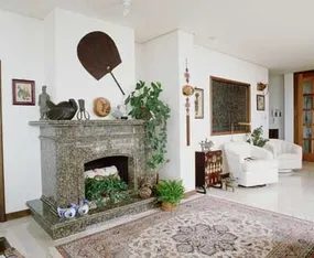
Mix your eras. Seriously. Put a 19th-century Spanish table next to American Empire chairs. It sounds wrong. It probably looks wrong at first glance. But try it. They work. There is an old rule in design. Buy only what you love. The rest follows. It is not magic. It is just confidence.
Think about lighting. Hang an antique brass lantern over a glass-topped modern desk. The brass catches the light. The glass reflects it. You get a moon over a water-like surface. It is dramatic. It is personal.
Mixing Vintage and Heirloom Pieces
An eclectic room is a collector’s dream. It holds the things you inherited. The stuff your grandmother hated. The vintage pieces you hunted down at flea markets. They coexist. The trick is giving them new jobs.
Small spaces need this. You cannot fit a full dining room set. You have to improvise.
- Chests as Sideboards: A heavy oak dresser does not have to be for clothes. Put it in the dining area. Use it to store linens or glassware. It becomes a sideboard.
- Trunks as Tables: Stack a leather suitcase on top of a blanket chest. Add a tray on top. You have a coffee table. It adds height. It adds texture.
- Nightstands as Desks: A small bedside table works for writing. Pull up a chair. Add a lamp. It is a nifty desk.
Why This Works
This approach is tricky. You are assigning new roles to old furniture. It forces you to see the object for what it is. Not what it was labeled. A chest is not just a chest. It is storage. It is a surface. It is a visual anchor.
When you pair disparate pieces, you create tension. Tension creates interest. A Spanish table is ornate. An Empire chair is severe. Together they balance. The eye moves back and forth. The room feels alive.
Practical Steps for DIY Styling
If you are working with limited square footage, these pairings are non-negotiable. You do not have room for dedicated furniture. You need multi-use items.
- Clear surfaces: Keep the glass desk clear except for the lantern and one plant. The brass needs space to shine.
- Check stability: When stacking suitcases for a table, ensure the bottom one is flat. Use a heavy tray to distribute weight. This prevents wobbling.
- Measure twice: A nightstand desk must fit under a window or against a wall without blocking flow. Measure the width. Leave space for the chair to slide out.
“Assigning furnishings new roles is a tricky way to include pieces you like in a small space.”
The Result
You end up with a room that no one else has. It tells a story. The Spanish table has history. The Empire chair has lineage. The lantern has patina. They do not match in style. They match in soul.
This is how you avoid the showroom look. You stop trying to coordinate. You start trying to connect. The room grows on you. It feels like home because it is made of things you actually chose.
What will you repurpose first? The old
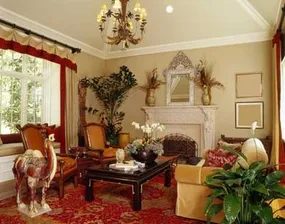
The trick to a kitchen that doesn’t feel like a sterile showroom is balance. You want the pull of professional gear but the hug of a lived-in space. Same goes for the bath. You aren’t just scrubbing there. You’re decompressing.
High-style modern lighting helps anchor the room. Pair it with fine hardwood cabinetry. It grounds the sleekness. The goal is warmth. Not cold efficiency.
Experiment Without Matching
Forget the old rule that everything has to coordinate perfectly. That’s a trap. Try a glass-block shower instead of a curtain. It lets light in but keeps privacy. Add a fruitwood French armoire to hide a small TV and store towels. It looks intentional. It looks expensive.
If you’re worried you’ve gone too far, trim it back. Jackie Kennedy told women to remove one accessory before leaving the house. Do that with your decor. Take one thing away. You might be surprised by how much better it looks.
Get the Look
- Farmhouse roots : Pair a rustic farmhouse table with new metal chairs. The contrast works.
- Modern antique : Place a Lucite lamp on an old desk. Clear acrylic against worn wood is a classic move.
- Gallery walls : Mix frame styles and sizes for photos and art. Don’t match them. It looks more curated that way.
Embrace Retro Without the Kitsch
Do you miss the 50s, 60s, or 70s? Maybe you just love vintage vibes. Retro-style decorating can fit if you avoid the tacky stuff. The next section covers how to pull off the look without it feeling like a time capsule from a bad movie.
To learn more about interior design and get tips and information on decorating your home, visit:
- Interior Decorating: Get tips on how to decorate your home and read about organizing a project and selecting an interior design that fits your lifestyle.
- Home Decorating Tips: Learn about home decorating styles and get tips on how to plan and complete decorating projects.
- Decorating a Room: Find out how to decorate a room from floor-to-ceiling.
- How to Design a Kitchen: Create a kitchen that works for you and get tips on how to choose and place appliances and create a decorating scheme.
- Kids Rooms: Get tips on decorating your child’s room, with information on colors, smart strategies, and money-saving tips.
Decorating Retro-Style
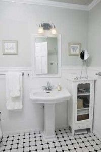
Retro isn’t a decade. It’s a grab-bag of the 20th century. You get the sharp angles of 1930s art deco mixing with the neon chaos of the 1960s. It’s irreverent. Bright. Fun.
This style works best when you treat it like a museum of your own life. Collectors love it because it lets them show off their flea-market hauls. Lava lamps. Chrome chairs. Weird garden gnomes. The result is often more energized than organized. That’s the point. Every item has a story.
The Mid-Century Ranch Vibe
If you live in a ranch house, the 1950s style fits naturally. No architectural trim. No fuss. Just organic shapes and abstract patterns.
Think happy-day rooms. They love vinyl seat cushions and lamps that look like flying saucers. It’s sleek. It’s chic. It’s cottage charming if you want it to be.
Finding authentic pieces is hard. The best items are collectible now. You’ll pay up for them. But you can still find mass-produced knockoffs at consignment stores and flea markets. Don’t overlook the small stuff.
A vintage game board mounted on a wall looks stunning. A plant hanger shaped like a fish? Put that in the bathroom. It’s dynamite.
Colors and Kitchens
Neutral walls help. They let the tongue-in-cheek assortment of objects take center stage. White or cream expands a tight space. This is basic interior design 101.
In the kitchen, go classic. Glossy white cabinets. Shiny chrome counter edging. Stainless-steel appliances. It’s a timeless combo.
Color teams matter. Black, red, and white? That’s roadside diner cozy. Do you prefer colorful dinnerware? Go Mexico-inspired. Bright colors throughout the room. Let your collections guide your palette.
Use color to enhance shapes. A pink-and-white plate sets a tone. A pressed-glass cranberry compote does the same. Pick your anchors. Build around them.
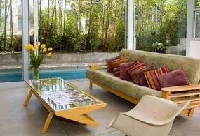
Floor and Fabric Choices for a Retro Vibe
You don’t need to gut a whole room to get that mid-century feel. Just switch the flooring. Retro-patterned vinyl or linoleum is the move for kitchens, bathrooms, or kids’ bedrooms. It sets a freewheeling tone immediately. Think squares of black, red, turquoise, or yellow mixed with white.
That color combo has a lively jukebox appeal. It works everywhere. If you already have hardwood or carpet, you can cheat. Toss a vintage rug with a geometric print over it. It adds extra zing without the installation headache.
Fabrics are where you can get fancy. Look for vintage or reproduction bark cloth for cushions, upholstery, and drapes. It comes in endless colors and patterns. Sputniks. Tropical flowers. Cowboys. The woven texture gives a room either a sophisticated edge or a kitschy one. You pick the lane.
Keep the drapes simple though. If you go too wild, it detracts from the other elements. Let the floor and furniture do the heavy lifting. The curtains just need to frame the view. Not steal the show.
“Woven bark cloth can give a room a sophisticated or kitschy edge.”
Sourcing Period-Appropriate Textiles
Finding the right fabric matters. You want that specific texture that screams 1950s or 60s. Bark cloth is heavy. It drapes well. It holds up.
- Search thrift stores for original pieces.
- Check online marketplaces for reproduction rolls.
- Look for bold, contrasting colors in geometric shapes.
Don’t overstuff the windows. Heavy patterns need breathing room. Simple rods work best. No elaborate tie-backs. Let the fabric speak for itself.
The goal is cohesion. The floor brings the energy. The rug adds texture. The bark cloth ties it together. It’s not about buying every retro item on the market. It’s about picking the right accents. The rest falls into place.
Or it doesn’t. And that’s fine. A slightly mismatched look can be its own kind of style.
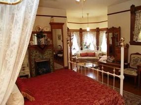
Lace doilies. Vintage tablecloths printed with floral and fruit motifs. Straw hats. Wicker baskets. These are the building blocks of a romantic, retro 1940s cottage vibe. It is a specific look that favors nostalgia over minimalism.
You can replicate this style without a massive budget. The key is repurposing simple items. Toss a vintage tablecloth or a wide scarf over a basic wood rod. Suddenly, you have a curtain. Lay a lace cloth over a sofa or bed frame. It adds a layer of fantasy to the room.
If this aesthetic appeals to you, lean into the botanical theme. Hang samplers and pressed-flower art on the walls. Use old watering cans as planters. Decoupage trays for display. Fill the space with white wicker furniture or pieces you paint white yourself.
Transforming Modern Finds with Paint
Take newer items from tag sales. Paint them white. Then apply a crackle glaze. This technique ages the surfaces instantly. The result looks endearing and lived-in.
Pair these pieces with pale walls. Use soft pink or light blue tones. The furnishings will feel light. They will resemble summer clouds against the backdrop.
Rotate your collections. Open shelves are great, but they can look cluttered. Install glass-front cabinets for smaller treasures. Think dainty perfume bottles or unique salt and pepper shakers. There is always another vintage find around the corner.
Practical Styling Tips
Keep the atmosphere lighthearted. Use bright-colored tiles in your kitchen or bathroom. It breaks up the soft pastels with energy.
Upholster footstools and piano seats with wildflower patterns. The contrast between the delicate lace and bold prints works well.
Define spaces using glass blocks. They divide rooms without blocking light. This maintains the airy feel central to the 1940s cottage style.
This approach focuses on a specific era. Other design philosophies center on global locations. We will explore how to bring African or Scandinavian influences into your home next.
Related Home Decor Resources
Interior Decorating
Advice on organizing projects and selecting styles that fit your lifestyle.
Home Decorating Tips
Guides on planning projects and understanding different decorating styles.
Decorating a Room
Floor-to-ceiling strategies for any room.
How to Design a Kitchen
Tips on appliance placement and creating a functional scheme.
Kids Rooms
Color strategies and budget-saving ideas for children’s spaces.
Decorating with a World Flair
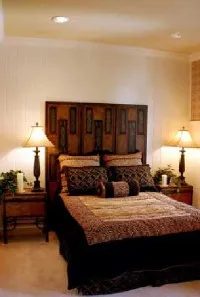
Why Global Decor Styles Are Easier Than Ever to DIY
Travel isn’t what it used to be. Or maybe it is. Either way, technology and cheap flights have erased borders. The result is an influx of fresh ideas that don’t require a passport to use.
You don’t need to leave your living room to celebrate global cultures. Mixing elements from Sweden, India, or Asia gives a space personality. It stops a room from looking like a catalog page.
The Caribbean Twist You Might Already Own
Think about what’s in your home right now. Do you have hurricane lamps? Wooden shutters? Tie-dyed fabrics? Maybe bright azure or lemon-yellow walls.
These aren’t random choices. They have roots in the Caribbean.
Consider the dark, boldly carved Colonial-style furniture. It’s highly coveted today. But it wasn’t made for aesthetics. It was made for British colonials who occupied the islands long ago.
You can replicate that vibe without spending a fortune.
- Add a ceiling fan.
- Choose rattan pieces.
- Include large plants.
The atmosphere shifts. It becomes breezy and relaxed.
Asian Influence on American Design
Bamboo. Porcelain. Lacquer. Silk. Bronze.
We love these materials. But they come from Asia. Architects and designers have looked there for centuries.
The impact was huge. The Art and Crafts movement in the 1930s was shaped by Asian furniture and fabric designs.
Then came the wars. Military personnel returned from World War II, Korea, and Vietnam. They brought Asian furnishings home. That sparked American interest. It wasn’t just trade. It was personal.
Now, trade barriers are mostly gone. Many sought-after Asian pieces are affordable. You can find them easily.
The Zen of Less
A Japanese aesthetic room offers something specific. Calm. Zen-like.
We need that. Everyday pressures are high.
The approach is simple. Less is more.
Clean lines. Open space. No clutter.
It works for any budget. It works for any skill level.
You just have to look beyond what you already know.
“A room derived from a Japanese aesthetic provides a calming, Zen-like atmosphere, which is just what we need to relieve the stress of everyday pressures.”
Look further. The world is in your hardware store.
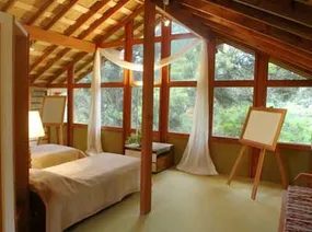
Walls dominate your square footage. They are the biggest canvas in the room. That makes them the most efficient place to start when you want to inject an Asian aesthetic into your living or dining area. You don’t need to rebuild. You just need to cover the surface.
Wall coverings are fast. They are simple. And they work immediately.
Natural Textures and Earth Tones
Start with patterns that mimic natural materials. Think bamboo. Think granite. Think cork. These aren’t just pictures of wood; they are textures that bring the outdoors in. Keep the colors subtle. Earth tones ground the space. They prevent the room from feeling like a theme park.
“Neutral-colored flooring such as sisal or sea grass rugs will allow your furniture to stand out.”
If you want more drama, look at grass cloth. It adds depth. It has a woven texture you can see and feel. Metallic grass cloth is another option. Copper or gold threads catch the light. This is not for minimalists. This is for those who want the room to have presence.
Flooring Choices Matter
Your floor sets the stage. Neutral-colored flooring is key. Sisal rugs work well. Sea grass is another solid choice. Both are durable. Both breathe.
These natural fibers keep the room lighter. They feel airier. This contrast allows your furniture to pop. A dark wood chair looks sharper against a light sisal floor. It creates visual hierarchy without you having to move a single piece of furniture.
Practical Considerations for DIYers
When you install these materials, preparation is everything. Walls need to be smooth. Any imperfection will show through grass cloth or metallic finishes. You might need to skim coat or sand. Don’t skip this step.
Check the humidity levels in your room. Some natural fibers react to moisture. If your space is damp, choose a synthetic alternative that looks like bamboo but won’t rot.
Safety first. When cutting these materials, use a sharp utility knife. Dull blades tear the weave. Tearing looks messy. It ruins the linear patterns that define the style.
Which material fits your budget? Grass cloth can be pricey. Standard vinyl with a bamboo print is cheaper but lacks texture. Decide what you value more: authenticity or cost.
The room shifts. It feels calmer. Less cluttered. That’s the goal. But are you ready to commit to the maintenance of natural fibers? They show wear differently than paint.
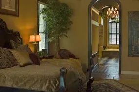
You don’t need to gut your entire house to bring Eastern home decor into your space. In fact, trying to force the style everywhere often ends up looking cluttered and inauthentic. The secret lies in restraint. Focus on one standout piece rather than filling the room with generic accents.
The Power of a Single Statement Piece
A high-quality focal point does more heavy lifting than a dozen cheap knick-knacks. Look for a shapely Japanese stair chest or an ornate antique Chinese table. These items carry history and craftsmanship that mass-produced replicas simply can’t match. They anchor the room. They give it character.
But there is a catch. You must respect scale. If your new star piece is massive, a tiny side table nearby will look lost. If it’s delicate, a bulky sofa might overwhelm it. Keep the proportions consistent. This subtle alignment ensures the new addition feels like it has always belonged there, rather than just being dropped in for a photo op.
Edit Before You Add
Once you’ve placed your anchor piece, strip the room bare. Remove every accessory. Then, put them back one by one. This isn’t about decoration; it’s about curation. Each item needs to carry the right message.
Think about small, high-impact changes. Take a hand-me-down bureau and swap out the brass knobs for metal handles inspired by Asian calligraphy. That minor alteration signals intent. It tells the eye that this is a designed space, not just a lived-in one. The hardware becomes a visual bridge between the furniture and the broader theme.
Nature Over Arrangement
Flowers can make or break this look. Most people think of a fussy, tightly packed bouquet. That’s not the Asian aesthetic. Decorators prefer grace over complexity.
Go for apple blossom branches or delicate yellow forsythia. You can even force your own branches to bloom every spring if you cut them in late winter and keep them in water. It’s cheaper than buying cut flowers, and it gives you a living, changing element in the room.
The goal is elegance, not excess. A few slender branches in a simple vase say more than a crowded floral centerpiece ever could.
“A cache of graceful apple blossom branches or delicate yellow forsythia are far more enlightened in an Asian-inspired room than a fussy arrangement.”
It’s about the feeling of the space. Light. Airy. Intentional. You aren’t building a museum. You’re creating a home that breathes differently.
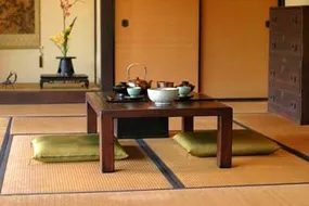
Go Global With Global Accents
You don’t need a passport to bring the world inside. Moroccan and Indian textiles are having a major moment, but the key is curation, not clutter. Look for throws and floor pillows with enough visual weight to hold their own in a Bedouin tent. The goal is inexpensive but carefully chosen artifacts that tell a story.
Consider jacquard panels in Indian-inspired patterns hung at your windows. They add texture without blocking light. Pair them with black-and-rust-colored hand-thrown pots from Tunisia. The result is an intriguing faraway flavor that feels intentional, not touristy.
In the bedroom, lean into the fantasy. A reproduction Balinese bed mounded with velvet pillows and layered with a lush Moroccan brocade duvet creates a scene straight out of the Arabian Nights. It’s dramatic. It’s cozy. Just make sure you have a hand-knotted rug from Turkey in mellow gold hues underfoot. Your toes will thank you every morning.
Where to look matters. Skip the big-box stores for this. Visit shops and galleries that specialize in imported furnishings, rugs, and art. A lovely 20th-century kimono hung on the wall works as an exotic accent piece that adds vertical interest.
Design centers, home stores, furniture shops, and mail-order catalogs are gold mines for globally inspired pieces. You can find everything from inexpensive hand-carved pagoda lamps to Chinese country baskets. For storage, look for lacquered Chinese-like units for books, CDs, and media. They offer function and flavor in one.
The Calm of Scandinavian Simplicity
From the top of the world comes another design breeze. It shares the pared-down, be-simple attitude of global styles but operates in a totally different venue. Originating in the mid-18th century under King Gustav III, Scandinavian style slides effortlessly into contemporary, open-plan houses.
It isn’t about deprivation. It’s about clarity.
Features that appeared long ago are being embraced again. Think delicate furniture. Uncluttered rooms. Decorative paintings that breathe. The spare lines and harmonious interiors address a modern need to slow down.
This style helps you appreciate life’s little things. The slant of morning sun across a bare floor. The stillness that envelops a house when snow falls outside. It’s a design philosophy that demands space for the eyes and the mind.
Start small. Remove one item from a surface. Let the light hit a simple wooden chair. You don’t need to overhaul the whole house to feel the difference. Just open up the space. Let the light in.
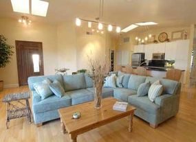
Swedish interior design wasn’t born from sunshine. It was born from long, dark winters where the sun might not peek over the horizon for months. The result is a style that manufactures its own light. You don’t need a window for this effect; you need paint.
Luminous shades of icy blue or muted white are the standard. They reflect whatever light you have. But you don’t have to stick to the classic recipe. Pale green works. Muted pink works too. The goal is the same: create an aura of brightness in plaster or paneled walls.
Wall Treatments and Tile
Traditional Swedish rooms often include simple swags or stenciled borders. Think summer flowers trailing along a wall. This adds visual interest without clutter. It works in a living room, bedroom, or bath. Wall-coverings are also an option. Just keep the scale dainty. Large patterns will fight against the light.
Blue-and-white tiles are a staple. Use them as a decorative ridge behind a kitchen or bath sink. Or frame a hearth. The contrast against the light walls keeps the space feeling crisp.
Flooring and Textiles
Dark, gloomy wood floors are a hard veto. They suck the air out of the room. Opt for light woods like beech or ash. If your existing floor is too dark, you can hide it under a coat of white paint. It’s a cheap way to change the mood.
Curtains should be simple. Unbleached muslin is the traditional choice. It lets light through. If you need a snap of color, gingham is a safe bet. It’s pretty and light-affirming. Avoid heavy drapes. They block the very thing this style relies on.
Furniture and Editing
Dark furnishings will upset the wintry mood. They feel heavy. If you have a mismatched group of furniture, a coat of pristine white pulls it all together. It unifies the space.
There is a catch though. Swedish rooms have few furnishings. What you keep is carefully arranged around a focal point. A ceramic-tiled stove or fireplace usually serves as that anchor. You need to edit. Cut down to a few well-loved, comfortable pieces. Less is not just a suggestion here. It’s the rule.
Get the Look
You can replicate these elements without a contractor.
- Cover pillows in crewel fabric or batik. The texture adds depth without weight.
- Frame a large vintage world map for the dining or living room. It fits the aesthetic and uses wall space efficiently.
- Bleach floors and walls to shape a Scandinavian decor. This is the fastest way to get that washed-out, light-filled look.
Arts and Crafts Transition
All these styles can come to life in your home. It’s just a matter of making a few decisions and finding the right materials. When you walk into your house and smile, you know you’ve done it right.
But Swedish style isn’t the only path. One style that has enjoyed a long popularity is Arts and Crafts. It values different materials and a different kind of honesty in construction. For an example of an Arts and Crafts-style room, see the next page.
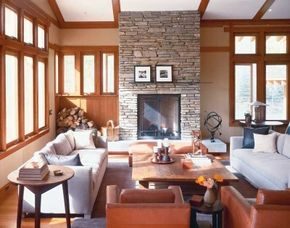
The Craft Behind the Look
You don’t have to live in the Rockies to get that grounded, hand-made feel. The secret isn’t just picking expensive wood. It’s about respecting the materials. Take the cherry mill-work. It’s meticulous. Not mass-produced. It screams Arts and Crafts style emphasis on craft because you can see the human hand in every joint.
Local Stone and Warm Wood
Pair that warm cherry with stone. Not just any stone. Local Idaho quartzite.
This isn’t some generic brick from a big-box store. Quartzite is a metamorphic rock. It forms from interlocking quartz grains. Hard. Dense. Real. When you slab it out for a great room hearth, it catches the light differently than manufactured stone. It has depth.
Mantel Design for Real Life
Here is where most DIYers mess up. They build a massive, heavy mantel that dwarfs the fireplace and pushes the art into the shadows.
Don’t do that.
Go for a sliver. A thin slab. You need space for favorite photographs on the hearth. If the wood is too thick, it blocks the view of the stone’s texture. It becomes an obstacle. The goal is to let the natural stone breathe. The wood frames it. It doesn’t fight it.
Why This Works for Skiers
Think about the room’s purpose. Skiers gather here. They are cold. They are tired. They want texture. They want warmth.
The stone holds heat. The wood absorbs sound. The low-profile mantel keeps the sightlines open. You aren’t looking at a wall of oak. You are looking at the fire. You are looking at the stone. It’s a retreat. It feels intentional. It feels like it was built by someone who cared about the grain of the wood and the hardness of the rock.
That’s the point. You can replicate this. Find a local quarry. Pick a wood species that ages well. Cut the mantel thin. Let the material speak.
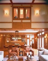
The Arts and Crafts movement didn’t just happen by accident. It was a mandate. Warm tones. High-quality materials that didn’t try too hard. Informal. The furniture? Comfortable. Not stiff.
Look at the kitchen. It sits right there in full view of the hearth. You can’t miss it. Cherry wood cabinetry runs through the space. It continues from the entry. Even the light fixtures aren’t just for show. They are reminders of the period’s core tenet: combine the useful with the beautiful.
Think about storage. That sensibility awards everything a spot. Every tool. Every dish. You don’t need to hide things away in panic. No matter how large the crowd, the room stays neat. It stays tidy.
Night changes the vibe. Pools of soft light spill out. Some even come from that cleverly placed second-story interior window. The light hits the mill-work. Makes it lustrous. The grain pops.
The design features patterns found in nature. Woodwork. Stone. The decorating scheme uses those same earthy colors. It feels grounded.
For an equally warm yet comfortable and homey look, see the next page to explore a Casual Chic design.
If you are trying to replicate this in your own DIY projects, start with the cabinetry. Cherry wood is a classic choice for Arts and Crafts style kitchens because it deepens in color over time. It ages well. It doesn’t feel fake.
When planning your lighting, don’t just hang a chandelier. Look for fixtures that highlight the woodwork. Angle them so the grain becomes part of the decor.
And for the clutter? Build it in. Shelves. Pantries. Drawers with dividers. The goal is a room that looks lived-in but never messy.
Casual Chic Decorating
Want to keep the warmth but drop the formality? Casual Chic is the answer. It borrows the comfort but loosens the rules.
To learn more about interior design and get tips and information on decorating your home, visit:
-
Interior Decorating: Get tips on how to decorate your home and read about organizing a project and selecting an interior design that fits your lifestyle.
-
Home Decorating Tips: Learn about home decorating styles and get tips on how to plan and complete decorating projects.
-
Decorating a Room: Find out how to decorate a room from floor-to-ceiling.
-
How to Design a Kitchen: Create a kitchen that works for you and get tips on how to choose and place appliances and create a decorating scheme.
-
Kids Rooms: Get tips on decorating your child’s room, with information on colors, smart strategies, and money-saving tips.
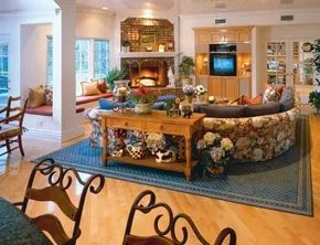
Balancing Cool Architecture with Warm Textures
The shell of this space is all clean lines. Shiny white floors. Glass tables. It’s easy for that kind of minimalist architecture to feel cold. Like a showroom no one lives in.
Then there is the decor.
It pulls the room back to earth. Casual chic styling stops the sterile vibe from taking over. It’s not about clutter. It’s about adding softness where the eye rests.
The window seat is a good example. Opening the wall at the base of it does more than just save space. It prevents that corner from becoming a dead zone. Now light flows in. Sightlines stay open. You don’t get shut off from the rest of the great room.
Bringing the Garden Indoors
Upholstery does the heavy lifting here.
Instead of cool leathers or stark linens, the fabric choices pull the garden inside. All year long. You get that botanical feel without the maintenance of real plants in every corner.
A soft area rug underfoot? Essential. It breaks up the hard surfaces. Mounds of puffy pillows add volume. They invite you to sit. To stay.
Warm-toned wood furnishings anchor the dining section. They offset the bare glass and reflective floors. The contrast keeps the room from feeling like a freezer.
Layered Comfort and Personal History
Look closer at the details.
The hearth features red-brown bricks. That color adds depth. It grounds the L-shaped window seat nearby. But coziness isn’t just about big furniture pieces.
It’s in the small touches.
- Art on the walls.
- Fresh flowers.
- Candles for evening light.
- Family photographs.
These items tell a story. They make the space feel lived-in. Not staged.
The combination of luxurious seating and personal artifacts creates a balance. It’s practical. It’s inviting. And it works because the hard architectural elements are softened by every layer added on top.
You can replicate this. Start with the base. Then add warmth. One pillow at a time.
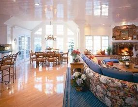
The boundary between the kitchen and the living area isn’t a wall. It’s a suggestion. By keeping these zones in close proximity, the architecture creates an intimate atmosphere. This layout works best when the house is full. Family members gather. Friends spill over. The space feels shared, not divided.
A curved sofa acts as a soft divider. It doesn’t block the view. It just gently separates the cooking zone from the sitting area. The shape guides traffic around the perimeter. You can cook dinner and still watch the room.
Serving on the Fly
When it’s time to eat, the furniture adapts. Stools slide under counters. The kitchen island transforms from a prep space into a serving station. You’re not moving trays across a distant dining room. You’re placing food right where people are standing or sitting.
This setup handles everything. A full turkey dinner? Fine. A simple bowl of chips and dips? Also fine. The architecture supports both. It allows for parallel activities. One person reads. Another watches the news. A third chops vegetables. They are in the same room. They are sharing time.
Lived-In vs. Minimalist
Decorating here leans toward the personal. Photos hang casually. Vases sit on tables. The room looks lived-in. It looks used. This stands in stark contrast to Southwestern decorating styles. Southwestern design often follows a minimalist approach. It strips away the clutter.
This kitchen area embraces the clutter. It’s about comfort. It’s about history. The decorations aren’t planned. They’re accumulated.
The casual placement of photos, vases, and other decorations give this room a very lived-in look.
If you’re trying to decide between a cozy, cluttered feel and a clean, sparse look, this layout supports the former. It thrives on the mess of daily life.
For those interested in the minimalist alternative, the next section covers Southwestern decorating. It offers a different perspective on space and style.
Southwestern Decorating
If you want to explore that minimalist route, the next page dives into Southwestern design principles. It’s a shift from the warm, crowded feel of the open kitchen to a more curated aesthetic.
The Architecture Sets the Stage
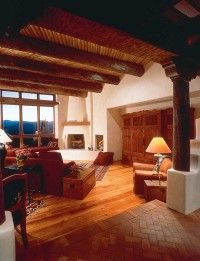
Step into this Southwestern living room and you’re immediately hit by the drama of the entryway. It’s not just a hallway; it’s a step-down design framed by massive pillars. That architectural drop acts as a prelude, signaling that the space beyond is different. More serious. Heavier.
The walls are creamy stucco. The ceiling is covered in wood. Both are traditional Southwest moves, but here they feel ancient. The beams carry visual weight. They suggest a vernacular style that has survived centuries with barely a tweak.
Material Contrast and Minimalist Furnishings
Brick meets wood. It’s a classic pairing, but in this room, it’s about texture. The roughness of the brick against the grain of the wood creates immediate visual interest without needing extra decor.
To let that architecture breathe, the furnishings had to be stripped back. Unpretentious. Straightforward. Minimal. If you clutter this space, you lose the character of the room. The architecture is the star. The furniture is just support.
“Pulling the chairs and furniture away from the wall allows them to float, stretching the room visually.”
The upholstery is chocolate brown. The chairs are rich leather. Dark tones. Heavy vibes. To keep it from feeling like a cave, you need contrast. Bright Navajo rugs. Green plants. That’s it. You don’t need more than that. The rugs pop against the dark wood. The plants soften the hard lines of the beams.
Floating Furniture for Depth
Here is the trick most people miss. Don’t push the sofa against the wall. Don’t line up the chairs in a row against the perimeter.
Pull them out. Let them float in the center of the room.
This does two things. First, it makes better use of the floor space. You’re not wasting the area near the walls. Second, it stretches the room visually. When furniture hugs the walls, the room feels smaller. When it floats, light and air move around it. The eye travels further.
It’s a subtle shift. But it changes how the entire Southwest aesthetic lands. The heavy beams hold the roof up. The floating furniture holds the eye.
Keeping the Tech Hidden
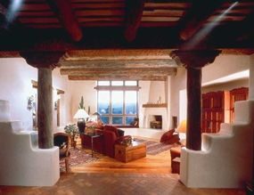
Black iron accents bring a heavy dose of Spanish influence into the space. That armoire looks like pure rustic storage, but it’s a clever disguise for your electronics. When the doors are shut, the vibe stays calm. No wires. No blinking lights. Just clean lines and texture.
Sunset and Floor Seating
This Southwestern room invites you to lounge on floor pillows by a fire. But the real star is the window seat. You’ll want to claim it at sunset. The rugged landscape outside turns the room into a canvas of blazing color.
Urban Interpretations
The wide-open spaces of the Southwest have shaped countless decorating styles. We’re moving from that rustic inspiration to how that spacious feeling translates indoors, especially in tighter city settings.
The goal isn’t just to copy a style, but to capture the feeling of openness.
Making Space Work in Small Footprints
You don’t need acreage to feel the breath of the Southwest. It’s about how you treat the empty air. In an urban apartment or condo, “spacious” is a mindset. It requires specific choices in furniture scale and light management.
Choose Low-Profile Furniture
Tall bookcases eat up vertical space visually. Swap them for low credenzas and platform beds. This keeps the sightlines clear. Your eye travels to the window, not the top of a cabinet.
Stick to a Neutral Base
Start with whites, tans, and warm grays. These colors bounce light around the room. They make corners recede. Add texture through throw pillows and rugs instead of painting the walls.
Use Mirrors Strategically
Place a large mirror opposite a window. It doubles the light and the view. Suddenly, that small living room feels twice as deep. It mimics the horizon line of the desert.
Declutter Ruthlessly
Clutter is the enemy of spaciousness. Every object needs a purpose or a home. If it doesn’t serve a function or bring joy, it shrinks the room. Use built-in storage where possible.
The Next Step
This approach to urban spaciousness relies on restraint. It’s not about adding more. It’s about letting the existing architecture breathe.
For more on how to execute this, check out these resources:
- Interior Decorating : Get tips on how to decorate your home and read about organizing a project and selecting an interior design that fits your lifestyle.
- Home Decorating Tips : Learn about home decorating styles and get tips on how to plan and complete decorating projects.
- Decorating a Room : Find out how to decorate a room from floor-to-ceiling.
- How to Design a Kitchen : Create a kitchen that works for you and get tips on how to choose and place appliances and create a decorating scheme.
- Kids Rooms : Get tips on decorating your child’s room, with information on colors, smart strategies, and money-saving tips.
Breaking Up the Space Without Breaking the Budget
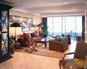
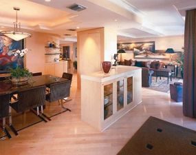
The goal here was simple. Keep the color palette static. No jarring treatments. Just smooth carving into distinct zones. The result feels huge. Why? Because shine and sparkle bounce light around. Glass shelves inside the cabinets catch the eye. Chrome-framed dining chairs do the same. It’s a trick, sure. But it works.
Black accents punch the design. They ground the room. Too much formality can feel stiff though. So, they brought in a mismatched chair. It’s catchy. It breaks the rules. It softens the edge.
The floor is pale wood. Silky smooth. It flows from sitting to dining without a break. The ceiling tells a different story. A low soffit drops down near the table. It beams above the dining set. It creates intimacy.
Then there’s the barrier. It’s not a wall. It’s an interesting arrangement of cabinetry. It blocks the view of the table from the living room. Traffic flows freely on both sides.
The wall-to-ceiling unit holds everything. China. Silver. Linens. Plenty of storage. But the waist-high segment is the real MVP. It acts as a serving station. A buffet. You don’t need a separate room for that. You just need the right height and the right angle.
“The waist-high segment of cabinetry performs as a serving station and buffet.”
Material Choices and Safety Considerations
When you’re tackling a project like this, materials matter. Glass shelving looks light. But it needs to be tempered. Safety first. If it breaks, you want shards, not shrapnel. Chrome frames are sleek. They resist tarnish. Wipe them down with a microfiber cloth. Avoid abrasive cleaners. They scratch the finish.
Wood flooring needs to be sealed. Properly. To keep that silky smooth feel. And to stop spills from soaking in. Especially near a dining area. You’ll drop things. You’ll spill wine. Seal it tight.
The soffit might hide ductwork or wiring. If you’re adding one, check your local building codes. Some areas require fireproofing materials inside soffits. Don’t skip the inspection.
Storage cabinets need to be anchored. Especially tall ones. Tip-over risks are real. Use L-brackets. Secure them to the wall studs. Not just the drywall. Drywall alone won’t hold a full cabinet of china.
DIY vs. Professional Help
Can you do this yourself? Partially.
Building the wall-to-ceiling cabinet requires precision. Shelves must be level. Doors must align. If you’re not confident with a circular saw and a level, hire a carpenter for the big stuff.
The waist-high buffet is easier. It’s just a box with legs or a base. You can build that in a weekend.
The mismatched chair? That’s pure style. Hunt thrift stores. Look for vintage pieces. Don’t match them. Contrast them. It adds character.
Glass shelves are tricky to source. You need cut-to-size tempered glass. Most hardware stores offer this service. Bring your exact measurements. Specify the thickness. Half-inch is standard. Quarter-inch might bow under weight. Don’t risk it.
Chrome chair frames can be refinished. Sand them down. Prime them. Paint them or powder coat them. It
Straight lines dominate the cabinetry wall. It is clean. Predictable. But look to the other side of the dining room entrance and the geometry changes. Here, the bar area curves. It isn’t just for aesthetics. It is user-friendly. Sharp corners cut. Curved edges guide. They allow traffic flow without bruised shins or bumped elbows. It is a subtle shift in the floor plan that makes the space feel larger. More open.
The art supply is plentiful. You can see it everywhere. But the living room takes the prize. The winning focal point is not a painting. It is not a fireplace. It is the floor-to-ceiling glass doors. They frame the outdoors. They pull in light. They dissolve the boundary between inside and out.
Making Curved Spaces Work in Home Renovation
Why curve a bar area? It is not just about looking fancy. It is about function. In tight quarters, corners waste space. They are dead zones. A curved wall utilizes that footprint differently. It creates a natural barrier without blocking sightlines.
When planning a bar nook, consider the radius. A tight curve feels intimate. A wide arc feels grand. For a dining room entrance, you want something that invites people in, not pushes them away. The material choice matters here too. Solid surface materials can be bent. Plywood can be steamed. Or you can build it out of straight sections with a rounded trim piece. The latter is the DIY-friendly route. It mimics the curve without the expensive fabrication.
Using Large Glass Doors as a Living Room Focal Point
Floor-to-ceiling glass doors are a massive statement. They change how a room feels instantly. But they require planning. You are not just installing windows. You are creating a portal.
Why choose floor-to-ceiling doors?
* Light: They bring in maximum natural light. This reduces the need for artificial lighting during the day.
* Space: They make small rooms feel bigger. The view extends the visual boundaries of the living room.
* Connection: They link the interior to the exterior. A patio, a garden, a yard. It all becomes part of the living space.
How to install floor-to-ceiling glass doors
1. Measure twice. You need to know the exact rough opening. These doors are heavy. The framing must be solid.
2. Check local codes. Egress requirements vary. If this is a bedroom or a main living area, you might need specific clearance for escape routes.
3. Choose the right track. Sliding doors are common. Pivot doors are trendy. French doors are classic. Pick the style that fits your traffic pattern.
4. Seal it tight. Air leakage is the enemy. Use high-quality weatherstripping. Insulation around the frame is non-negotiable.
Balancing Art and Architecture in Interior Design
You have art. Plenty of it. But does it compete with the architecture? If you have a stunning view through glass doors, let that be the star. The art should complement, not fight.
Consider the scale. Large pieces work well against blank walls. Smaller galleries work in tight spaces. But if your living room is dominated by glass, keep the art